


If you’ve visited our website recently or seen us pop up on social media, you may have noticed something looks a little different. We’ve updated the MokoHost logo, and we want to be transparent about why we did it, what changed, and what stayed the same.
This isn’t a rebrand in the sense that we’re becoming a different company. The name is the same, the green is the same, the people behind it are the same. What changed is how we present ourselves visually, and it was a change that had been a long time coming.
What the Old Logo Looked Like
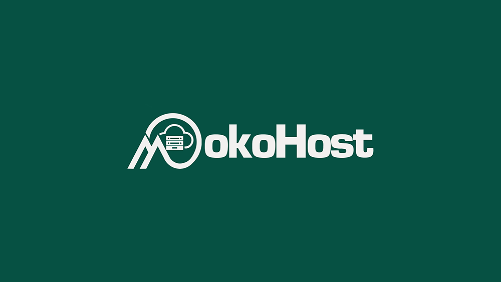
The original MokoHost logo was busy. There was a circular badge with a cloud and server stack inside it, an angular “M” letterform on the left, and bold mixed-case lettering that read “MokoHost”. It had a lot going on.
To be fair, it did the job when we first launched. It communicated hosting, you could see the server, the cloud, and the infrastructure symbolism. But over time, as we grew and started showing up in more places, on mobile screens, in email signatures, on smaller UI elements, the complexity started working against us. It was hard to scale down. It didn’t reproduce cleanly on different backgrounds. And honestly, it looked like a logo that was designed in a hurry, because it was.
What the New Logo Looks Like
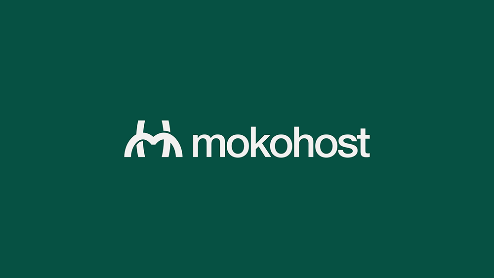
The new logo strips everything back to its essentials. The icon is a clean, bold “M”, but not just any M. Look at it closely, and you’ll see it’s constructed from two arch shapes that suggest connectivity, stability, and upward movement. No server illustration. No cloud graphic. No badge. Just a mark that’s confident enough to stand on its own.
The wordmark next to it now reads “mokohost” in all lowercase. The result is a logo that works at any size. It looks the same on a favicon as it does on a billboard. It sits cleanly on light backgrounds, dark backgrounds, and everything in between. That kind of versatility matters more than most people realise when you’re running a company that shows up in a lot of different places.
Why We Made the Change
We’ll be straight with you: the old logo was holding us back.
MokoHost has grown since we started. We’re not just a small hosting provider anymore, we’re building toward something bigger, expanding our presence across Nigeria and Africa, and working with clients and partners who judge you, at least partially, on how professional you look. The old logo didn’t reflect where we are today, or where we’re going.
There’s also something to be said for simplicity in the hosting industry specifically. The companies that have lasted, the ones that are trusted, tend to have marks that are clean, recognisable, and not trying too hard. We wanted MokoHost to feel like it belongs in that company.
The rebrand wasn’t done overnight. We went through several rounds of concepts, tested the mark across different use cases, and made sure the new identity still felt unmistakably like us before we committed to it. The green stayed because it’s ours. The M stayed because it’s the foundation of the name. Everything else that was decorative and unnecessary, gone.
What This Means for You
If you’re an existing customer, nothing about your service is changing. Your hosting, your domains, your support, all of it continues exactly as before. You might just notice a fresher look on our website, our communications, and our social channels as we roll out the new identity across all our touchpoints over the coming weeks.
If you’re new to MokoHost, welcome. You’re seeing us at our best.
A Note on the Journey
Building a hosting company in Nigeria is not the easiest thing to do. We compete against well-funded international players and established local names. Every decision we make, including something as seemingly small as a logo, is made with the intention of building something that lasts and that Nigerian businesses can be genuinely proud to trust with their online presence.
The new logo is a small thing on its own. But it’s part of a larger story of a company that’s getting more serious, more focused, and more intentional about everything it does.
We’re proud of it. We hope you like it too.